

A curated selection of publication design projects completed by Colors in the Sky. This collection highlights books, catalogs, and printed editions developed for galleries, museums, and publishers. Each work reflects our approach to layout, typography, and the visual rhythm of long-form design.
More projects will be added over time as documentation allows.
Notice: The portfolio reshuffles itself daily, presenting the projects in a random order to avoid any sense of hierarchy among projects.
Service Pages
This page serves as a visual portfolio, highlighting selected client projects we've completed. For a deeper look into our process, capabilities, and deliverables, please visit the related Service pages. Those entries provide detailed explanations, additional examples, and a clearer view of our approach.
Jacob Collins 2015 Exhibition
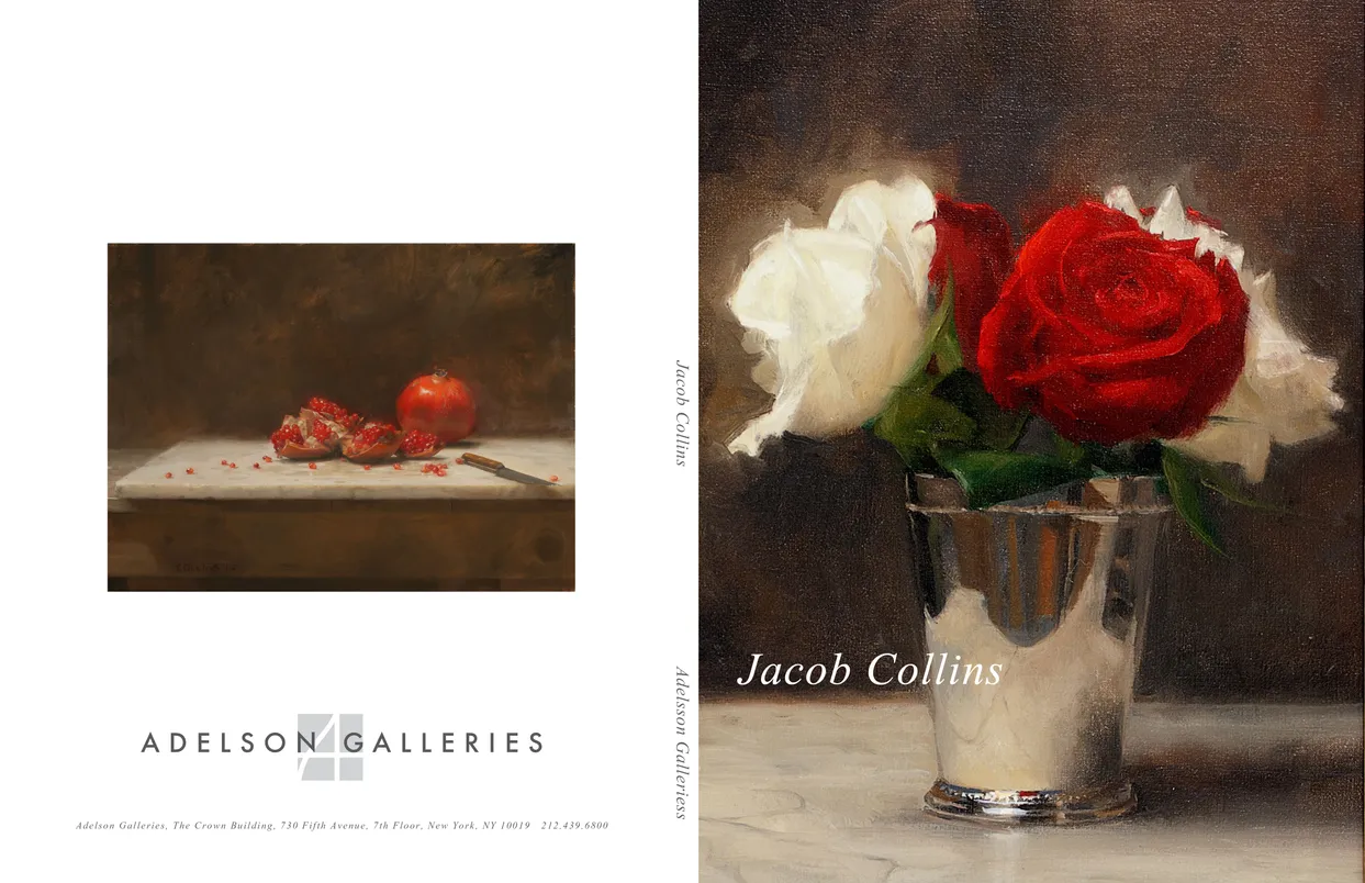
- Jacob Collins (2015) exhibition catalog, cover
- Client: Adelson Galleries
- Designer: Alex Stevovich / Colors in the Sky
- Client: Adelson Galleries
The companion catalogue to the Jacob Collins (2015) exhibition at Adelson Galleries, presenting a focused selection of recent still lifes, portraits, and figure studies rooted in Collins’ classical, representational practice. His work is known for its exceptional restraint, clarity, and sensitivity to light — qualities that guided the design language of the catalogue.
Working within Adelson Galleries’ established aesthetic, we developed a quiet, spacious layout with generous margins, minimal ornament, and a measured serif typography that echoed the discipline and calm of Collins’ technique. Images were presented at large scale with understated captions to allow the craft, surface, and atmosphere of each painting to stand on its own.
The result is a refined companion publication that supports the timeless character of Collins’ work while remaining consistent with the visual standards of the gallery.
Book design, layout, typography, image preparation, and production coordination by Alex Stevovich for Adelson Galleries.
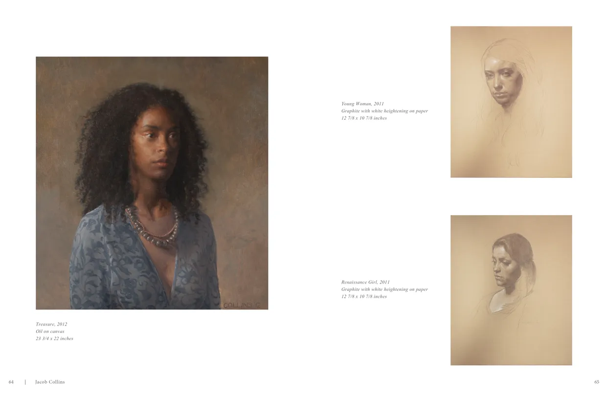
- Jacob Collins (2015) exhibition catalog, pages 64-65
- Client: Adelson Galleries
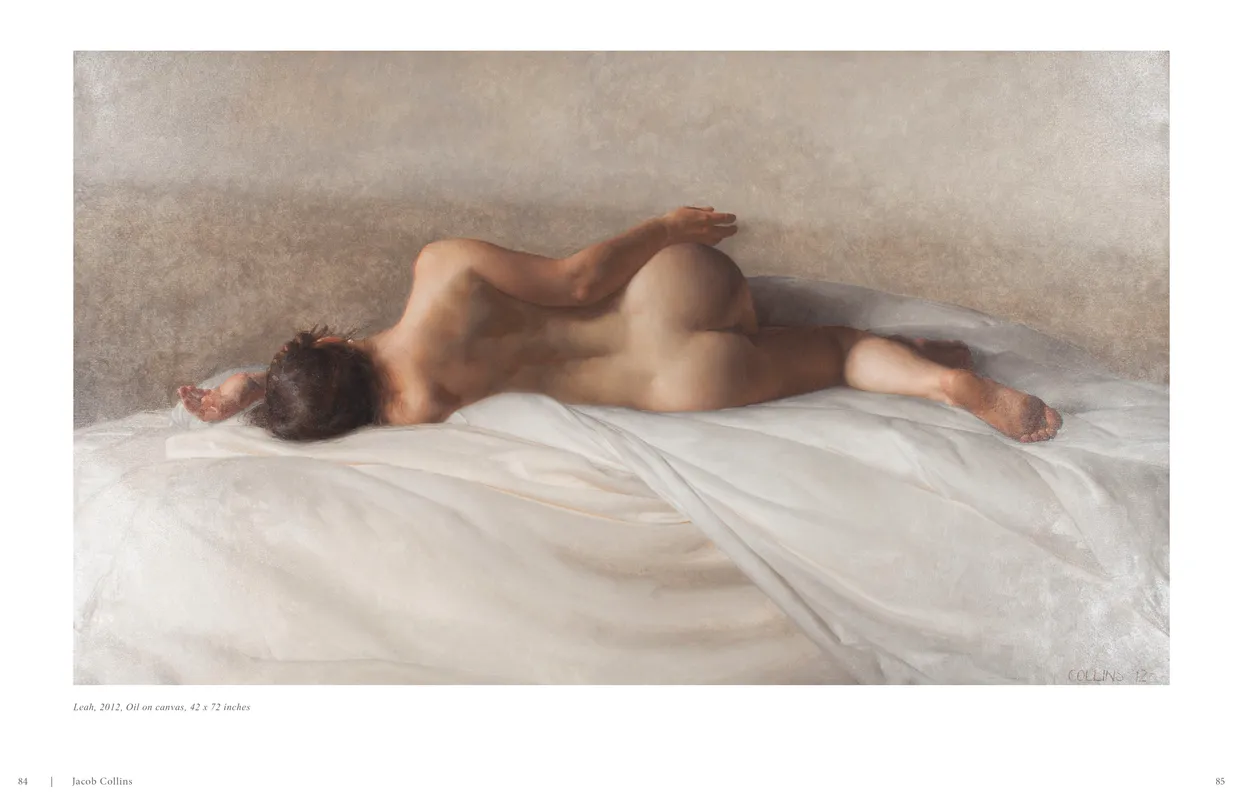
- Jacob Collins (2015) exhibition catalog, pages 84-85
- Client: Adelson Galleries
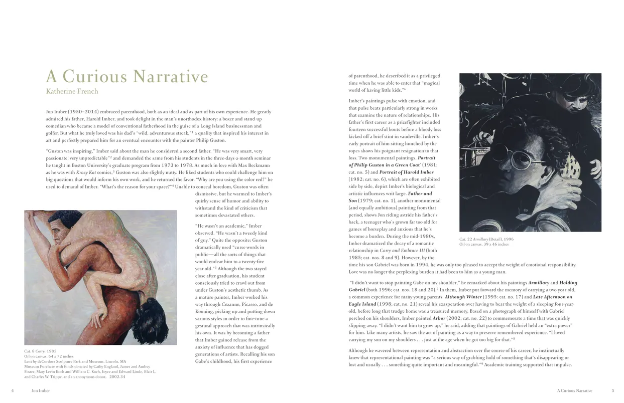
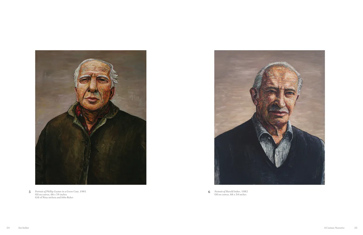
Jon Imber
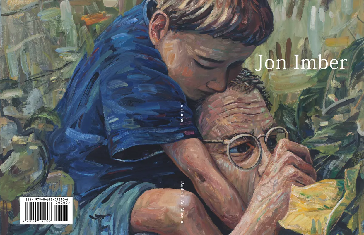
- Jon Imber exhibition catalog, cover
- Client: Danforth Art Museum
- Designer: Alex Stevovich / Colors in the Sky
- Client: Danforth Art Musuem
- Director of Publications: Adam Adelson
Jon Imber accompanied a memorial retrospective at the Danforth Art Museum, structured as a traditional monograph with an extended essay by Katherine French. The catalogue required a quiet, respectful design approach that allowed both the writing and the artworks to unfold at an unhurried pace.
For the essay section, we developed a flowing text layout with images woven into the narrative at measured intervals, supporting the long-form scholarship. The plates section followed a more classical fine-arts structure: clean spreads, paired works, and restrained typography.
A full-spread cover image was selected for its emotional resonance and compositional strength, providing an immediate, immersive entry point into Imber’s world. Overall, the book was designed to be understated, elegant, and faithful to the contemplative character of Imber’s work.
Book design, layout, typography, image preparation, and production coordination by Alex Stevovich for Danforth Art Musuem.
- Jon Imber exhibition catalog, pages 4-5
- Client: Danforth Art Museum
- Jon Imber exhibition catalog, pages 24-25
- Client: Danforth Art Museum
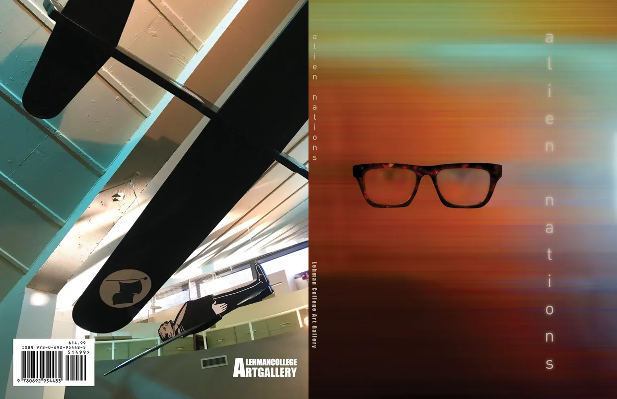
Alien Nations (2017)
- Alien Nations (2017) exhibition catalog, cover
- Client: Lehman College Art Gallery
- Designer: Alex Stevovich / Colors in the Sky
- Client: Lehman College Art Gallery
- Executive Director: Bartholomew F. Bland
- Curator: Yuneikys Villalonga
- Editorial Director: Linda Locke
Alien Nations (2017) was curated by Bartholomew F. Bland and Yuneikys Villalonga, the first in our series of themed catalogues for the Lehman College Art Gallery. The exhibition explored alienation as a contemporary condition, which guided a design language rooted in isolation, distance, and a subtly surreal atmosphere.
Drawing from the mood and visual cues present in works by artist Carla Gannis, we were inspired by alienation as a bizarre filter on reality and developed expressive hero pages using isolated, unordered details to achieve this tone. A vertical orange titling approach added clarity and presence while supporting the bold narrative voice of the show.
The catalogue remained clean and breathable so each artist’s work could stand clearly within the design. Editorial Director Linda Locke was closely involved in the design phase, offering insights and ideas that provided invaluable support and helped elevate the project.
Book design, layout, typography, image preparation, and production coordination by Alex Stevovich for Lehman College Art Gallery.
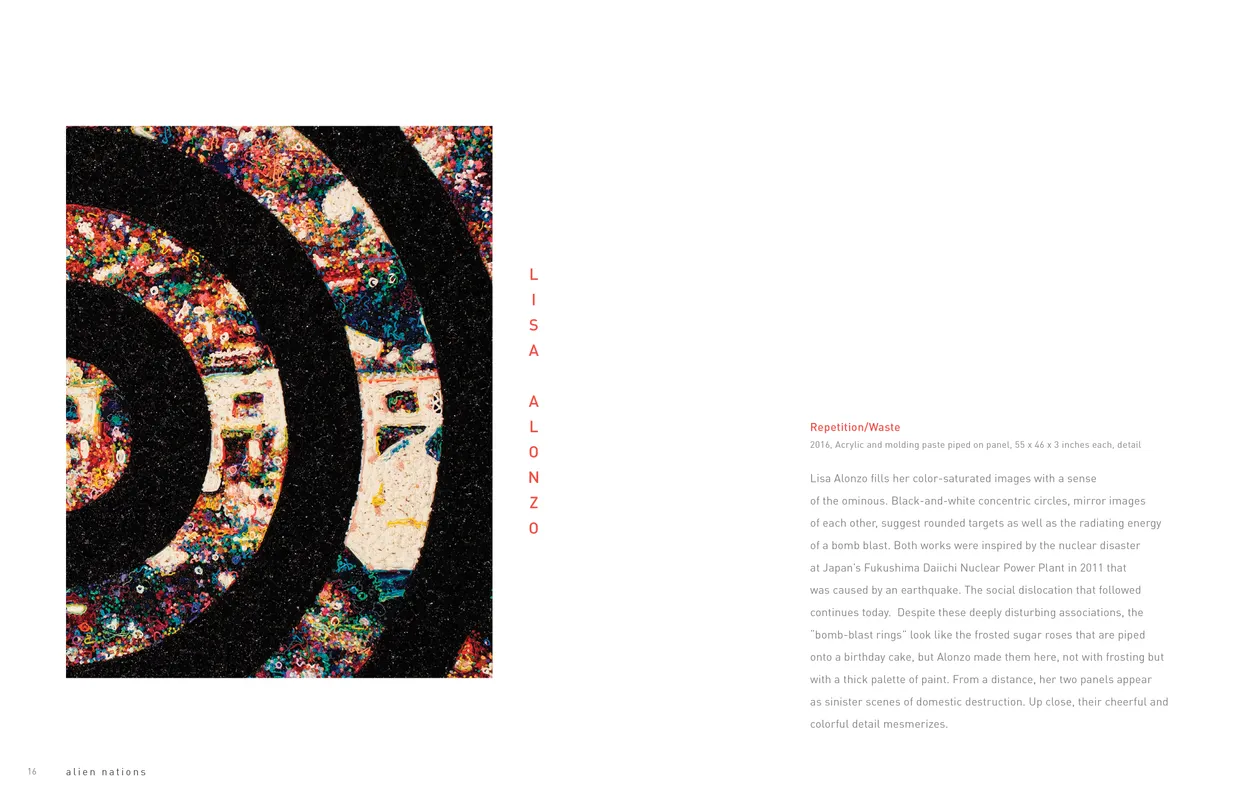
- Alien Nations (2017) exhibition catalog, pages 16-17
- Client: Lehman College Art Gallery

- Alien Nations (2017) exhibition catalog, pages 42-43
- Client: Lehman College Art Gallery
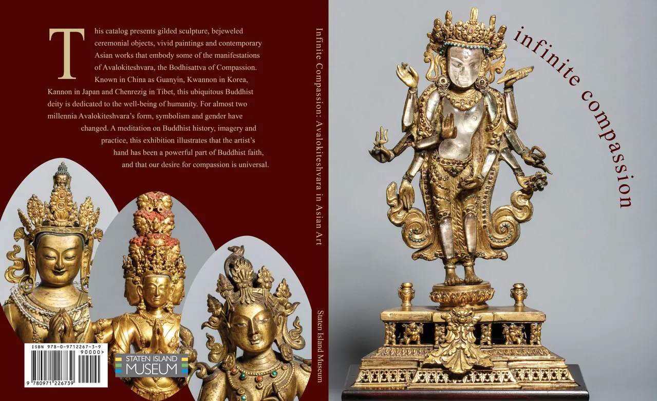
Infinite Compassion: Avalokiteshvara in Asian Art
- Infinite Compassion: Avalokiteshvara in Asian Art exhibition catalog, cover
- Client: Staten Island Museum
- Designer: Alex Stevovich / Colors in the Sky
- Client: Staten Island Museum
- Director of Publications: Linda Locke
Infinite Compassion: Avalokiteshvara in Asian Art was created for a joint exhibition of the Staten Island Museum and the Jacques Marchais Museum of Tibetan Art. With sculptures, thangkas, and ritual objects drawn from multiple Asian traditions, the catalogue required a presentation that balanced clarity, reverence, and cultural nuance.
A major part of the design effort involved the 'silo' of every artwork — carefully isolating each piece from its background to create clean, striking visuals that let form and craftsmanship stand fully in view. Essay pages were shaped around these silhouettes, with text flowing along edges and contours to echo the physical presence of the objects.
To support the exhibition’s tone, we introduced a restrained silver-and-warm-beige palette for section openers, adding quiet atmosphere while keeping the layout contemporary and measured.
Director of Publications Linda Locke was closely involved in the design phase, offering insights and ideas that provided invaluable support and helped elevate the project.
Book design, layout, typography, image preparation, and production coordination by Alex Stevovich for Staten Island Museum.
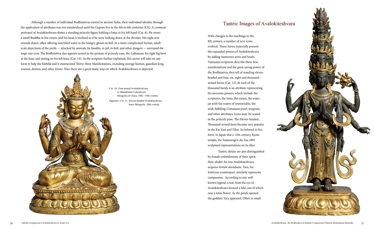
- Infinite Compassion: Avalokiteshvara in Asian Art exhibition catalog, pages 20-21
- Client: Staten Island Museum
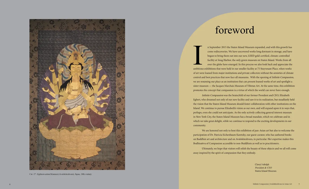
- Infinite Compassion: Avalokiteshvara in Asian Art exhibition catalog, pages 6-7
- Client: Staten Island Museum
Andrew Wyeth: Seven Decades
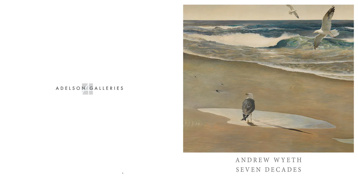
- Andrew Wyeth: Seven Decades exhibition catalog, cover
- Client: Adelson Galleries
- Designer: Alex Stevovich / Colors in the Sky
- Client: Adelson Galleries
Andrew Wyeth: Seven Decades was organized by Adelson Galleries as a comprehensive survey of Wyeth’s seven-decade career. Designing a publication for an artist of this stature required restraint, clarity, and a deep respect for the quiet emotional power of his work. We approached the layout with wide margins, generous breathing room, and large, minimally captioned reproductions, allowing each image to stand on its own without distraction.
We working within the established visual language we’ve developed for Adelson Galleries, a restrained, timeless approach used across their publications, advertising, and digital materials. The essay sections resluted in a consistent serif typographic system, chosen to suit the quiet authority of Wyeth’s work. The square format of the catalogue reinforced a sense of balance and contemplative stillness, aligning naturally with the gallery’s aesthetic standards and with the character of Wyeth’s landscapes, interiors, and portraits.
The result is a companion catalogue that honors both the exhibition and the legacy of a defining American artist.
Book design, layout, typography, image preparation, and production coordination by Alex Stevovich for Adelson Galleries.
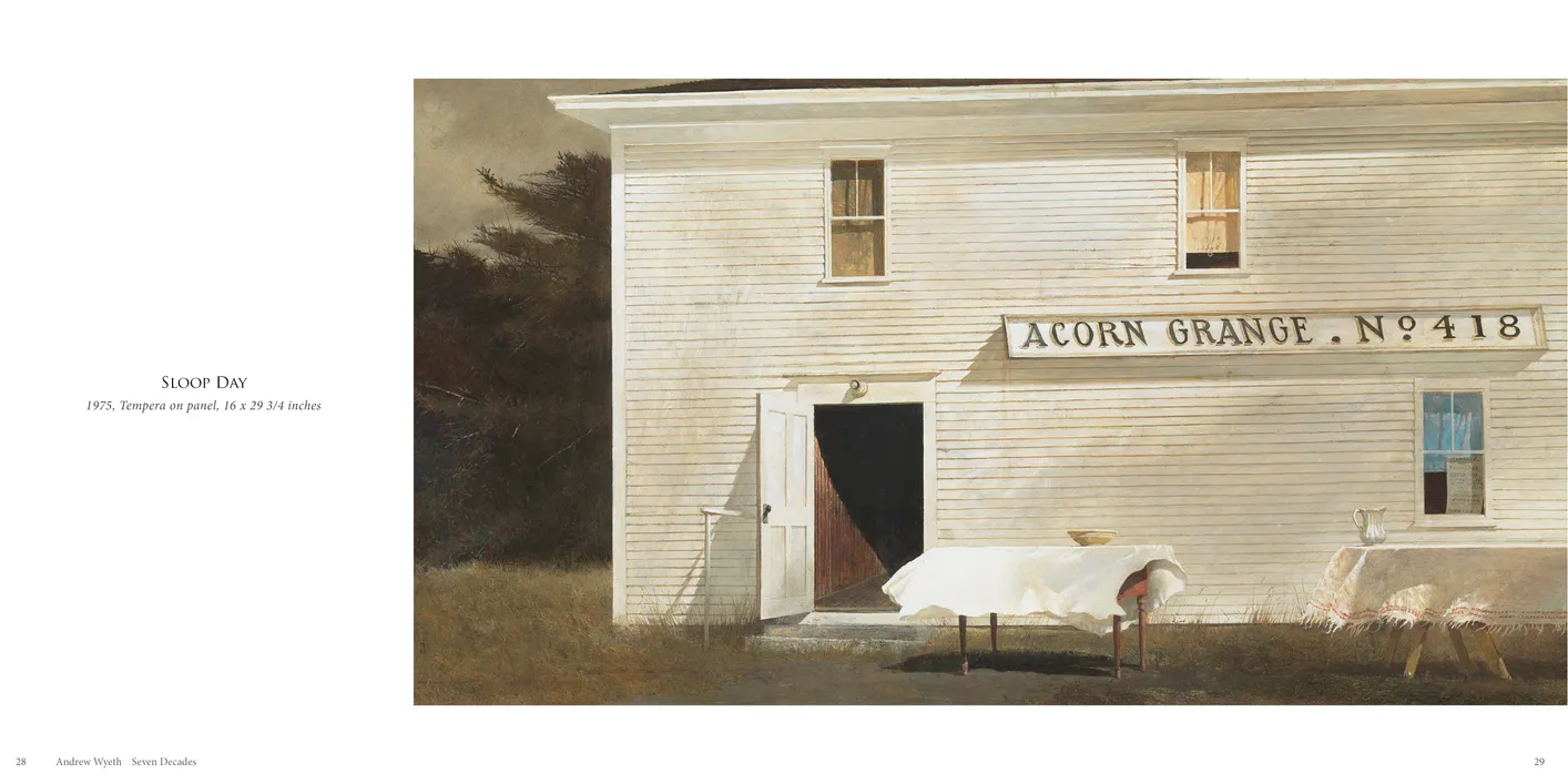
- Andrew Wyeth: Seven Decades exhibition catalog, pages 28-29
- Client: Adelson Galleries
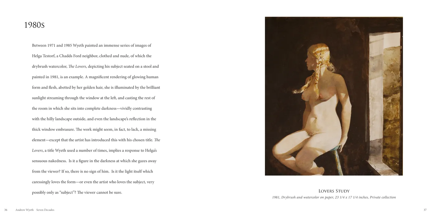
- Andrew Wyeth: Seven Decades exhibition catalog, pages 36-37
- Client: Adelson Galleries
The Eyes Have It
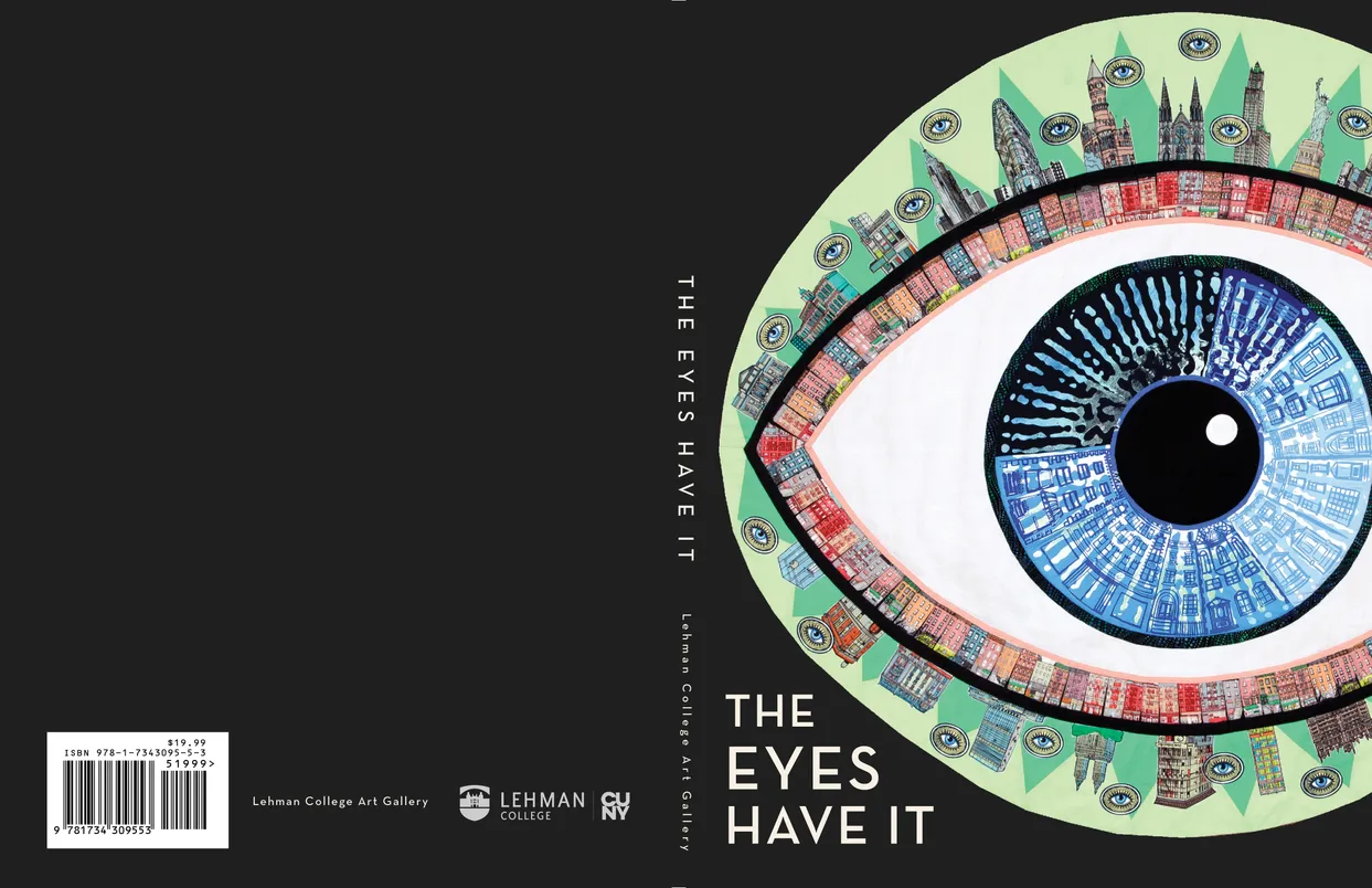
- The Eyes Have It exhibition catalog, cover
- Client: Lehman College Art Gallery
- Designer: Alex Stevovich / Colors in the Sky
- Client: Lehman College Art Gallery
- Executive Director: Bartholomew F. Bland
- Curator: Laura J. A. De Riggi
- Publication Director: Linda Locke
The Eyes Have It was curated by Bartholomew F. Bland, Executive Director of the Lehman College Art Gallery, with co-curator Laura J. A. De Riggi. As part of our ongoing collaboration with the gallery’s themed group exhibitions, we continued the established approach of allowing these catalogues to be more expressive than traditional fine-arts publications.
For this volume, the visual language was drawn directly from the exhibition’s focus on sight and perception. We used deep blacks reminiscent of the pupil, crisp white space, and subtle typographic inflections to evoke the idea of a “window to the soul.” Cropped details and close-up fragments appeared throughout the layouts, echoing themes of focus, scrutiny, and the nature of seeing.
A flexible layout system supported the wide range of media and artist essays, keeping the presentation clear while allowing the artworks’ conceptual boldness to shine. Publication Director Linda Locke was closely involved in the design phase, offering insights and ideas that provided invaluable support and helped elevate the project.
Book design, layout, typography, image preparation, and production coordination by Alex Stevovich for Lehman College Art Gallery.
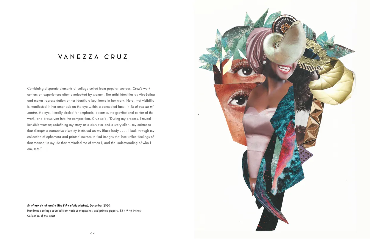
- The Eyes Have It exhibition catalog, pages 64-65
- Client: Lehman College Art Gallery
- The Eyes Have It exhibition catalog, pages 132-133
- Client: Lehman College Art Gallery
Andrew Stevovich: Familiar Faces
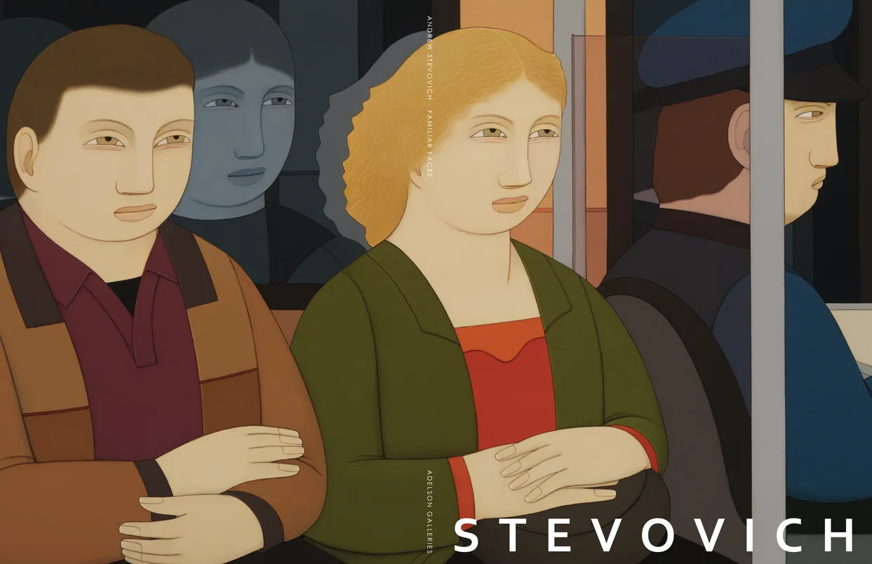
- Andrew Stevovich Familiar Faces exhibition catalog, cover
- Client: Adelson Galleries
- Designer: Alex Stevovich / Colors in the Sky
- Client: Adelson Galleries
Andrew Stevovich: Familiar Faces accompanied Adelson Galleries’ dual-venue exhibition of recent paintings and drawings by Andrew Stevovich. His quiet psychological narratives, distilled compositions, and precise formal language guided a design approach rooted in restraint, clarity, and respect for the subtlety of the work.
Because Stevovich’s scenes encourage viewers to imagine their own stories, we adopted a minimal layout structure: generous white space, full-bleed spreads, and understated captions that let each image stand on its own. The pacing draws on the calm rhythm of fine-arts publishing while introducing a subtle cinematic flow well suited to his figurative style.
Working within Adelson Galleries’ established visual standards, we paired a clean serif typographic system with a gloss glaze on all images to enhance color and surface nuance. The result is a catalogue that presents Stevovich’s work with the quiet strength and accessibility his paintings naturally invite.
Book design, layout, typography, image preparation, and production coordination by Alex Stevovich for Adelson Galleries.
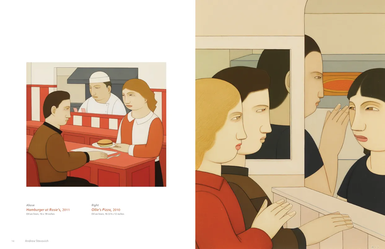
- Andrew Stevovich Familiar Faces exhibition catalog, pages 14-15
- Client: Adelson Galleries
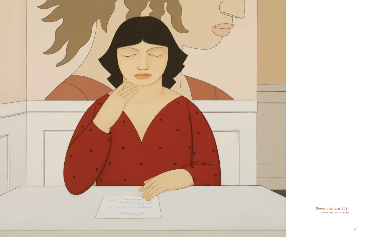
- Andrew Stevovich Familiar Faces exhibition catalog, pages 32-33
- Client: Adelson Galleries
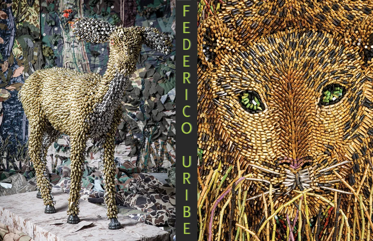
Federico Uribe: Animals and Friends in Pencils, Books, and Bullets
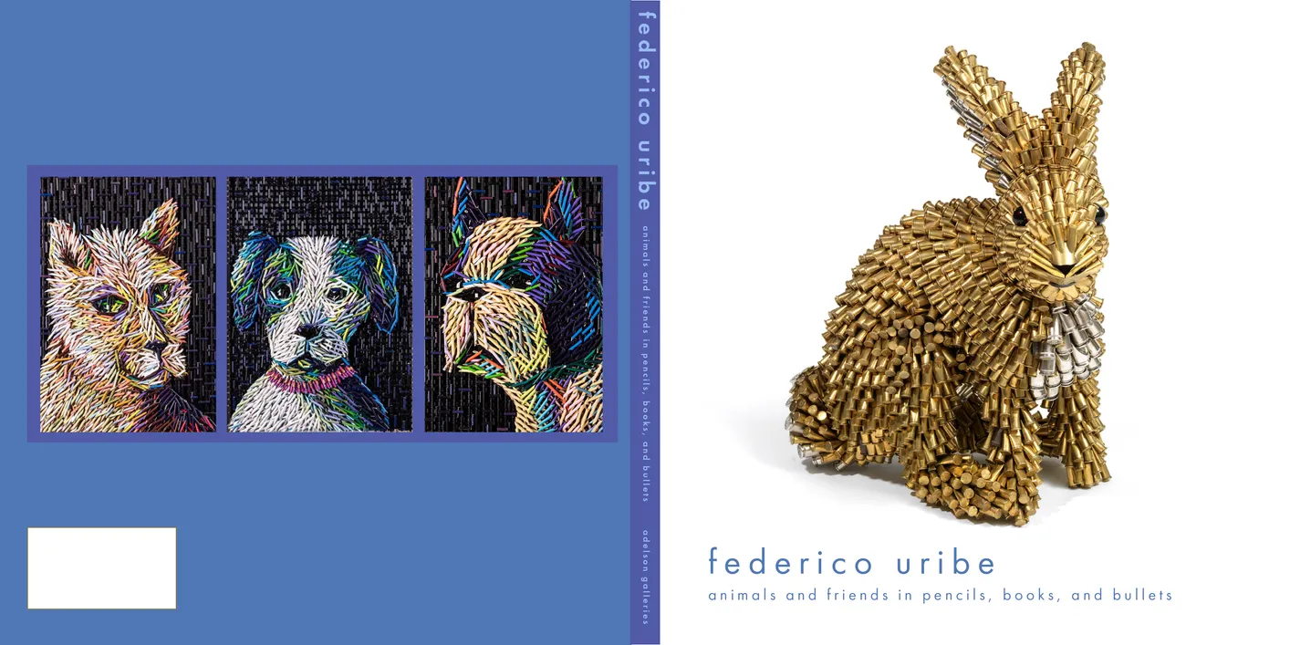
- Federico Uribe: Animals and Friends in Pencils, Books, and Bullets exhibition catalog, cover
- Client: Adelson Galleries
- Designer: Alex Stevovich / Colors in the Sky
- Client: Adelson Galleries
Federico Uribe: Animals and Friends in Pencils, Books, and Bullets accompanied Adelson Galleries’ exhibition of Uribe’s sculptural animal works made from bullet shells, pencils, and cut books. Because the pieces are visually bold and richly textured, the catalogue was designed with clean, open pages and minimal typography, using a contemporary sans-serif that supported the work without competing with it.
The cover introduced a more playful tone inspired by the exhibition’s whimsical narrative spirit, featuring a lone rabbit formed from bullet shells on a soft blue field — a storybook-like gesture that set the mood for the volume.
Book design, layout, typography, image preparation, and production coordination by Alex Stevovich for Adelson Galleries.
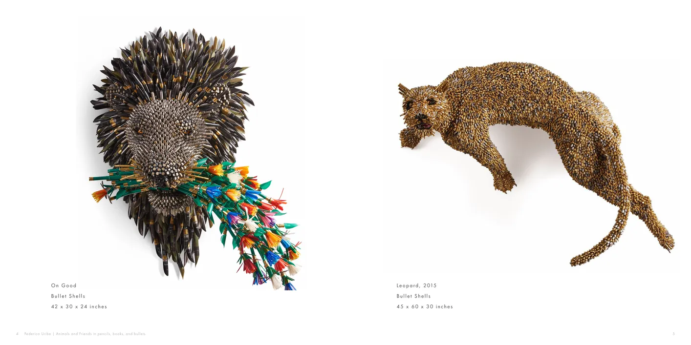
- Federico Uribe: Animals and Friends in Pencils, Books, and Bullets exhibition catalog, pages 4-5
- Client: Adelson Galleries
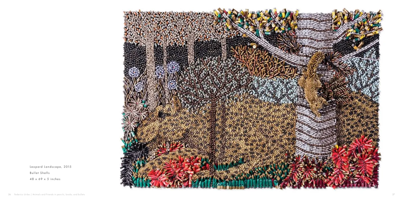
- Federico Uribe: Animals and Friends in Pencils, Books, and Bullets exhibition catalog, pages 26-27
- Client: Adelson Galleries
Peter Reginato: Fiction
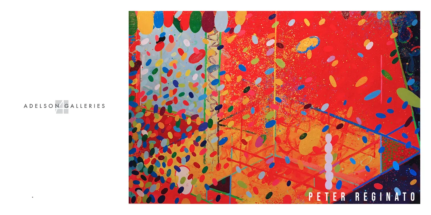
- Peter Reginato: Fiction exhibition catalog, cover
- Client: Adelson Galleries
- Designer: Alex Stevovich / Colors in the Sky
- Client: Adelson Galleries
Peter Reginato: Fiction was an exhibition catalogue produced for Adelson Galleries, showcasing a recent body of Reginato’s paintings — a compelling extension of the color, rhythm, and form long seen in his sculptural work.
Working within the gallery’s established visual language, we used a calm, spacious layout with restrained typography and generous image scale to let the paintings’ energy and chromatic movement stand at the forefront. Because this exhibition centered on works on canvas rather than sculpture, the catalogue adopted a cleaner, more graphic sensibility.
The result is a refined companion publication that reflects Adelson Galleries’ understated aesthetic while presenting this facet of Reginato’s work.
Book design, layout, typography, image preparation, and production coordination by Alex Stevovich for Adelson Galleries.
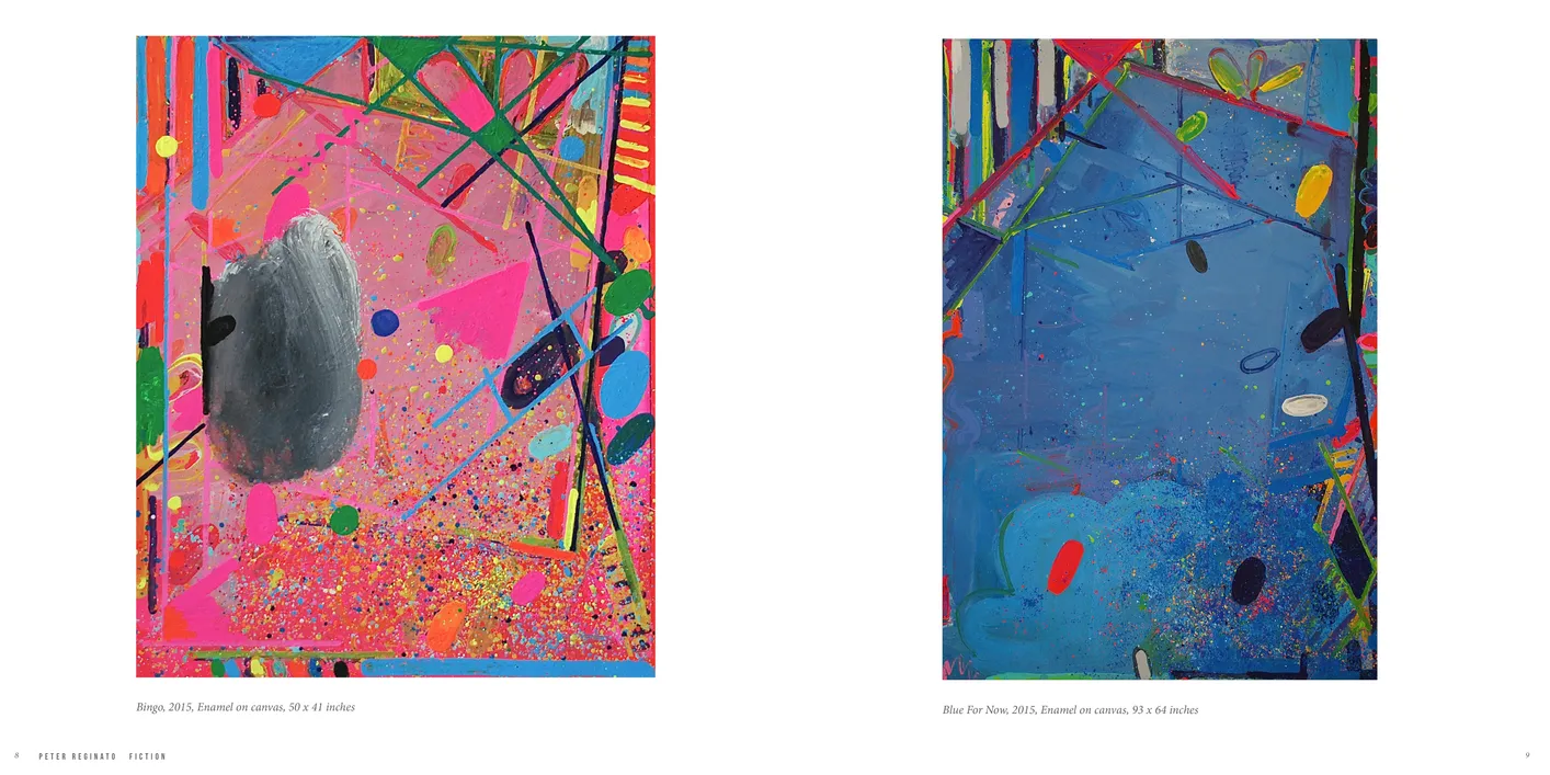
- Peter Reginato: Fiction exhibition catalog, pages 8-9
- Client: Adelson Galleries
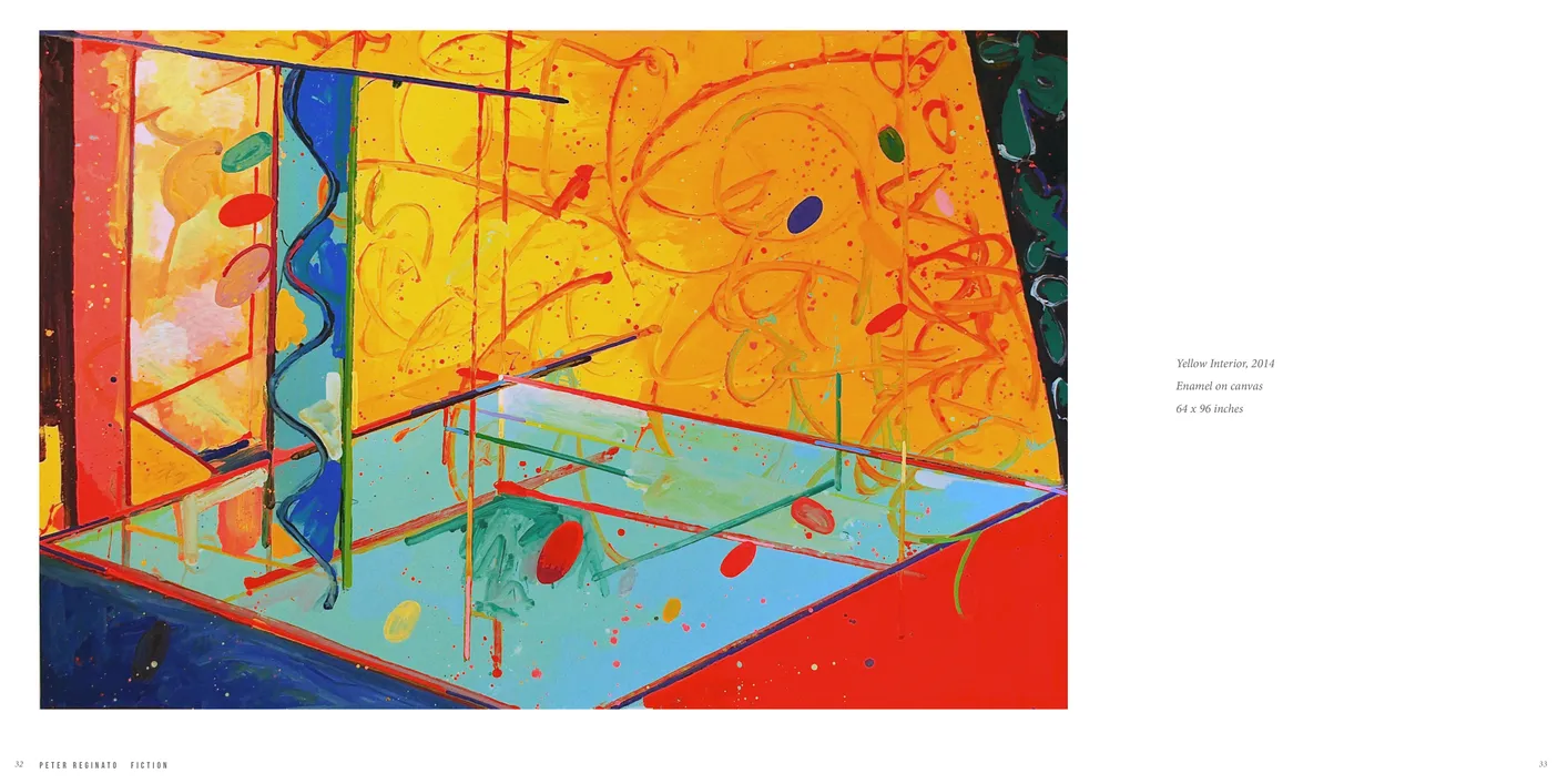
- Peter Reginato: Fiction exhibition catalog, pages 32-33
- Client: Adelson Galleries
Alien Nations 2020
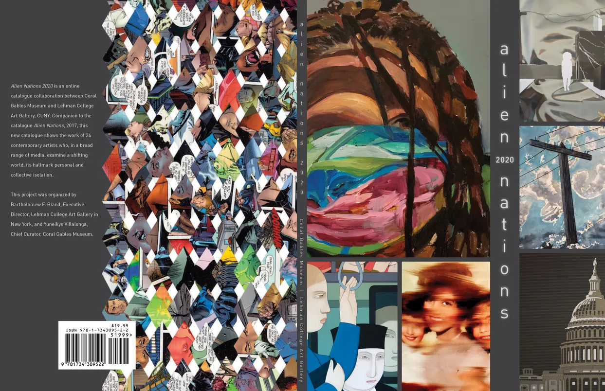
- Alien Nations 2020 exhibition catalog, cover
- Client: Lehman College Art Gallery
- Designer: Alex Stevovich / Colors in the Sky
- Client: Lehman College Art Gallery
- Executive Director: Bartholomew F. Bland
- Editorial Direction: Linda Locke
Alien Nations 2020 was curated by Bartholomew F. Bland and Yuneikys Villalonga and presented at the Coral Gables Museum as a continuation of the 2017 exhibition organized for the Lehman College Art Gallery. The show revisited themes of alienation, identity, and psychological distance — this time set against the heightened social, political, and technological atmosphere of 2020.
To maintain continuity with the earlier volume, we carried forward the vertical titling approach and select visual motifs, adapting them to a new body of work that included bold installations, film stills, and richly detailed pieces. Given the strength of the artwork itself, we opted for a more restrained overall layout, allowing the artists’ images to anchor the visual experience.
To bring thematic resonance into the catalogue — a hallmark of our rapport with the Lehman College Art Gallery’s themed series — we developed extracted visual motifs, drawn from prominent elements within the artworks. These appeared as floating accents on the hero spreads, sometimes placed on dark grey fields to evoke a sense of void, dislocation, or surreal drift.
Editorial Director Linda Locke was closely involved in the design phase, offering insights and ideas that provided invaluable support and helped elevate the project.
Book design, layout, typography, image preparation, and production coordination by Alex Stevovich for Lehman College Art Gallery.
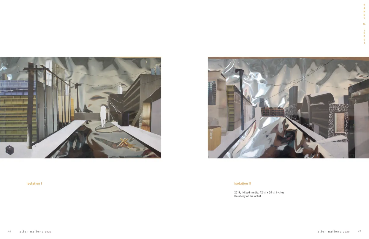
- Alien Nations 2020 exhibition catalog, pages 46-47
- Client: Lehman College Art Gallery
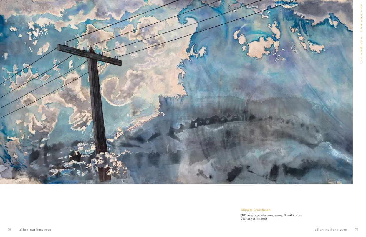
- Alien Nations 2020 exhibition catalog, pages 70-71
- Client: Lehman College Art Gallery
Frohawk Two Feathers: Kill Your Best Ideas
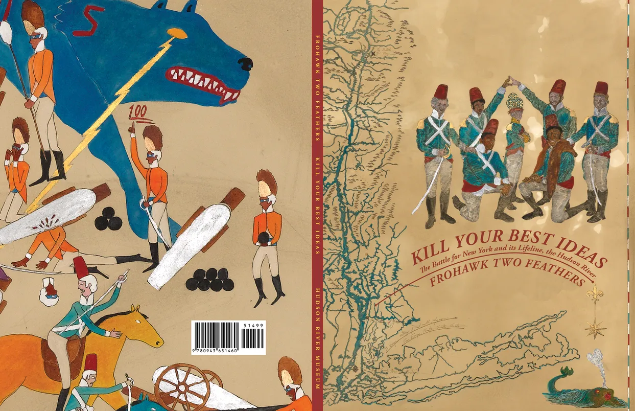
- Frohawk Two Feathers Kill Your Best Ideas exhibition catalog, cover
- Client: Hudon River Museum
- Designer: Alex Stevovich / Colors in the Sky
- Client: Hudson River Museum
- Director of Publications: Linda Locke
Frohawk Two Feathers: Kill Your Best Ideas, The Battle for New York and Its Lifeline, the Hudson River was organized by the Hudson River Museum as the final chapter of Umar Rashid’s alternate-history series The American Proteus. The catalogue needed to support both the exhibition’s scholarship and the artist’s elaborate fictional lore, so we adopted a design approach that blended the structure of a historical text with the tone of a narrative chronicle.
The essays intertwined art-historical context with Rashid’s invented histories, and the layout followed a clear, disciplined grid with quiet typography to let the storytelling carry through. Select spreads included installation views that placed Rashid’s work alongside Hudson River School paintings, underscoring the exhibition’s dialogue between real and imagined histories of the region.
Director of Publications Linda Locke was closely involved in the design phase, offering insights and ideas that provided invaluable support and helped elevate the project.
Book design, layout, typography, image preparation, and production coordination by Alex Stevovich for Hudson River Museum.
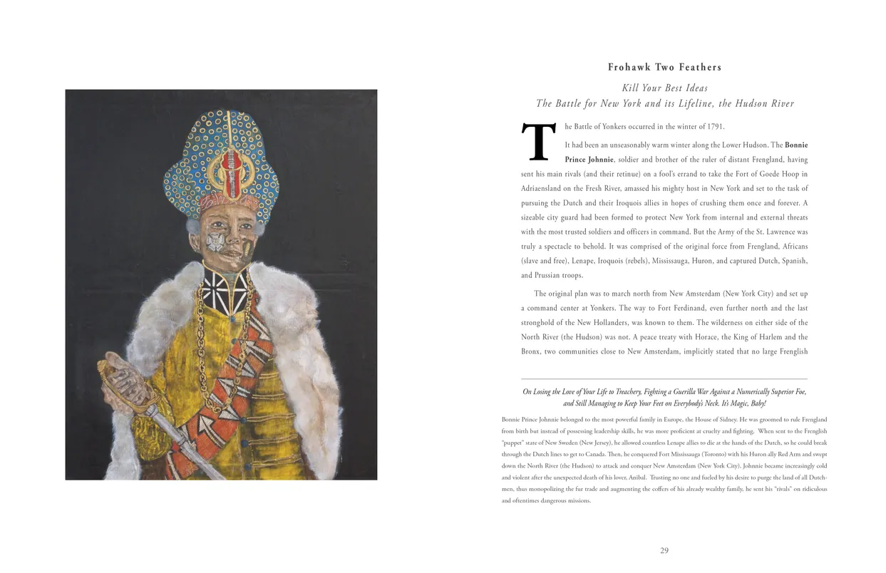
- Frohawk Two Feathers Kill Your Best Ideas exhibition catalog, pages 28-29
- Client: Hudon River Museum
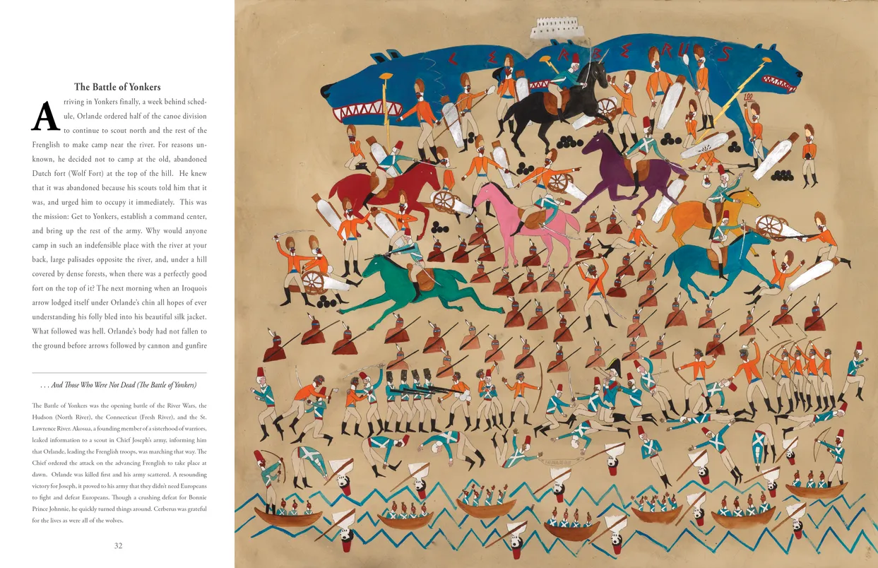
- Frohawk Two Feathers Kill Your Best Ideas exhibition catalog, pages 32-33
- Client: Hudon River Museum
Federico Uribe: Drawn in Pencils
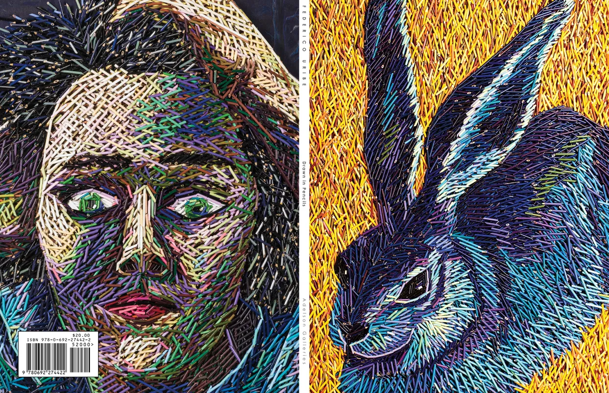
- Federico Uribe Drawn in Pencils exhibition catalog, cover
- Client: Adelson Galleries
- Designer: Alex Stevovich / Colors in the Sky
- Client: Adelson Galleries
- Editor: Lisa Hankin
- Editor: Hubbard Toombs
- Editor: Bartholomew F. Bland
Federico Uribe: Drawn in Pencils accompanied Adelson Galleries’ 2014 exhibition of Federico Uribe, whose works are constructed from hundreds of precisely cut colored pencils arranged into intricate, painterly compositions. Because these pieces operate as both image and object, the catalogue design centered on presenting their tactile, sculptural qualities.
Many works were prepared as isolated “silo” cutouts — a non-trivial process given the jagged, irregular edges of the medium — allowing the forms to float cleanly on the page without backgrounds. This approach created a striking yet minimal presentation in which the vibrant, rhythmic surfaces of Uribe’s work carried the visual energy while the surrounding layout remained quiet and controlled.
Typography was kept minimal but bold enough to complement the dynamism of the artwork. The publication also featured specialized production effects: all images were printed with a subtle gloss glaze, and the cover included a custom emboss created from a hand-built height map of Hare, designed to evoke the tactile physicality of Uribe’s pencil constructions.
Book design, layout, typography, image preparation, and production coordination by Alex Stevovich for Adelson Galleries.
- Federico Uribe Drawn in Pencils exhibition catalog, pages 6-7
- Client: Adelson Galleries

- Federico Uribe Drawn in Pencils exhibition catalog, pages 10-11
- Client: Adelson Galleries
Dark and Stormy Night: Gothic Influence in Contemporary Art

- Dark and Stormy Night: Gothic Influence in Contemporary Art exhibition catalog, cover
- Client: Lehman College Art Gallery
- Designer: Alex Stevovich / Colors in the Sky
- Client: Lehman College Art Gallery
- Director: Bartholomew F. Bland
- Editor: Linda Locke
Dark and Stormy Night: Gothic Influence in Contemporary Art was curated by Bartholomew F. Bland, Executive Director of the Lehman College Art Gallery, as a large group show, timed for a Halloween-season release. For these themed group exhibitions, we have an established design standard across our prior catalogs that allowed for a more expressive presentation compared to traditional fine-arts publications — we discovered bold atmospherics, a surreal glow, and carefully restrained decorative dark motifs that heightened the theme without overshadowing the artworks.
Because group shows demand versatility, we created a stable, flexible layout system capable of handling diverse media, artist essays, and image formats, supported by a few expressive hero spreads adapted from source material. The result is a catalogue that is visually striking yet grounded in clarity and sophistication. Editor Linda Locke was closely involved in the design phase, offering insights and ideas that provided invaluable support and helped elevate the project.
Book design, layout, typography, image preparation, and production coordination by Alex Stevovich for Lehman College Art Gallery.
- Dark and Stormy Night: Gothic Influence in Contemporary Art exhibition catalog, pages 14-15
- Client: Lehman College Art Gallery

- Dark and Stormy Night: Gothic Influence in Contemporary Art exhibition catalog, pages 30-31
- Client: Lehman College Art Gallery
Federico Uribe: Watch the Parade
- Federico Uribe: Watch the Parade book, cover
- Client: Adelson Galleries
- Designer: Alex Stevovich / Colors in the Sky
- Client: Adelson Galleries
- Publisher: Skira Editore Spa
- Publication Direction: Linda Locke
- Author: Bartholomew F. Bland
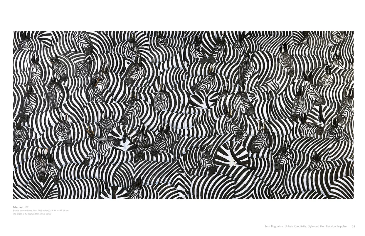
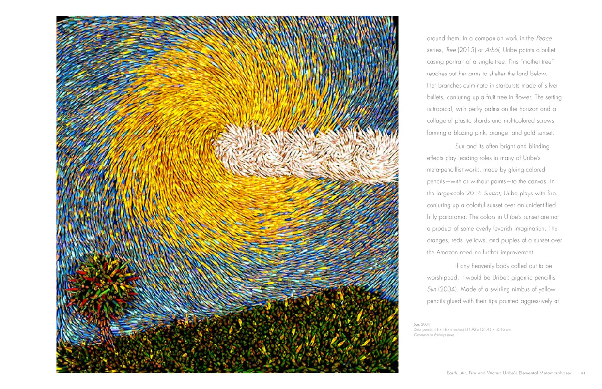
Watch the Parade is a comprehensive survey of Federico Uribe’s work, published by Skira and produced in partnership with Adelson Galleries. Spanning nearly thirty years—from early oils to his inventive assemblages made of everyday materials—the book presents a vivid arc of Uribe’s artistic evolution.
The catalogue alternates between essay sections and portfolio-style plate groupings. For the essays, we established a color-themed structure for each chapter, beginning with a large drop-cap introduction paired with a prominent artwork to set the tone. The plate sections shift into a calmer, more spacious layout, allowing Uribe’s intricate objects—whether formed from pencils, shoes, or hardware—to stand on their own with clarity and impact.
The result is a cohesive visual narrative that balances lively expression with refined presentation, supporting both the whimsy and craftsmanship that define Uribe’s work. Publication Directio Linda Locke was closely involved in the design phase, offering insights and ideas that provided invaluable support and helped elevate the project.
Book design, layout, typography, image preparation, and production coordination by Alex Stevovich for Adelson Galleries.
- Federico Uribe: Watch the Parade book, pages 32-33
- Client: Adelson Galleries
- Federico Uribe: Watch the Parade book, pages 90-91
- Client: Adelson Galleries
OH PANAMA! Jonas Lie Paints the Panama Canal
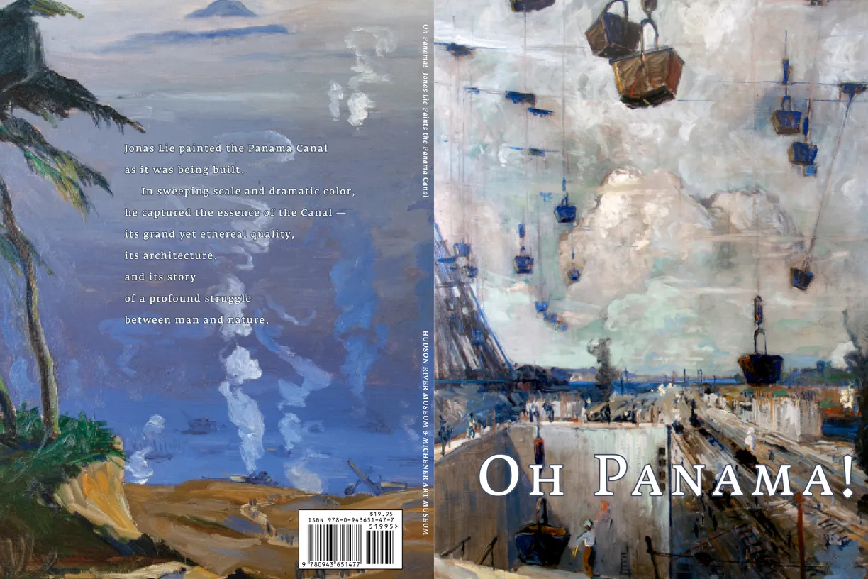
- Oh Panama! Jonas Lie Paints the Panama Canal exhibition catalog, cover
- Client: Hudson River Museum & Michener Art Museum
- Designer: Alex Stevovich / Colors in the Sky
- Client: Hudson Riven Museum & Michener Art Museum
- Director of Publications: Linda Locke
Oh, Panama! Jonas Lie Paints the Panama Canal was organized by the Hudson River Museum and the James A. Michener Art Museum to mark the canal’s centennial. The catalogue combined substantial historical material with Lie’s vivid paintings, calling for a layout that balanced academic clarity with strong visual presentation.
We created a flexible design system to support essays, archival context, and special feature spreads — including postcard layouts and historical information pages — while keeping the plate section minimal and spacious so the artwork could stand on its own. A consistent typographic framework unified the catalogue, with selective expressive touches where the historical narrative benefited from added emphasis.
Director of Publications Linda Locke was closely involved in the design phase, offering insights and ideas that provided invaluable support and helped elevate the project.
Book design, layout, typography, image preparation, and production coordination by Alex Stevovich for Hudson Riven Museum & Michener Art Museum.

- Oh Panama! Jonas Lie Paints the Panama Canal exhibition catalog, pages 64-65
- Client: Hudson River Museum & Michener Art Museum

- Oh Panama! Jonas Lie Paints the Panama Canal exhibition catalog, pages 88-89
- Client: Hudson River Museum & Michener Art Museum
Castles in the Sky: Fantasy Architecture in Contemporary Art

- Castles in the Sky: Fantasy Architecture in Contemporary Art exhibition catalog, cover
- Client: Lehman College Art Gallery
- Designer: Alex Stevovich / Colors in the Sky
- Client: Lehman College Art Gallery
- Exhibition Director: Bartholomew F. Bland
- Publication Director: Linda Locke
Castles in the Sky: Fantasy Architecture in Contemporary Art was curated by Bartholomew F. Bland at the Lehman College Art Gallery, later traveling to the Coral Gables Museum. The exhibition brought together a wide range of contemporary artists exploring imaginary structures — dreamlike, impossible architectures filled with color, atmosphere, and conceptual play.
Given the fantastical nature of the artwork, the design approach favored clarity and restraint. The pieces themselves radiated such vibrancy and intricacy that a clean, understated layout allowed their visual impact to speak unfettered. While we avoided heavy thematic motifs, we created a few expressive interlude spreads — poem and quote pages with custom graphic elements adapted from the artworks — including atmospheric treatments for the interior covers.
Publication Director Linda Locke was closely involved in the design phase, offering insights and ideas that provided invaluable support and helped elevate the project.
Book design, layout, typography, image preparation, and production coordination by Alex Stevovich for Lehman College Art Gallery.

- Castles in the Sky: Fantasy Architecture in Contemporary Art exhibition catalog, pages 54-55
- Client: Lehman College Art Gallery

- Castles in the Sky: Fantasy Architecture in Contemporary Art exhibition catalog, pages 80-81
- Client: Lehman College Art Gallery
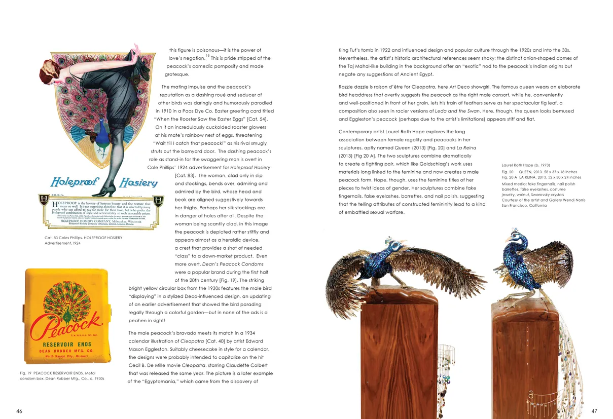
Strut: The Peacock and Beauty in Art

- Strut: The Peacock and Beauty in Art exhibition catalog, cover
- Client: Hudson River Museum
- Designer: Alex Stevovich / Colors in the Sky
- Client: Hudson River Museum
- Publisher: Co-published by the Hudson River Museum and Fordham University press
- Director of Publications: Linda Locke
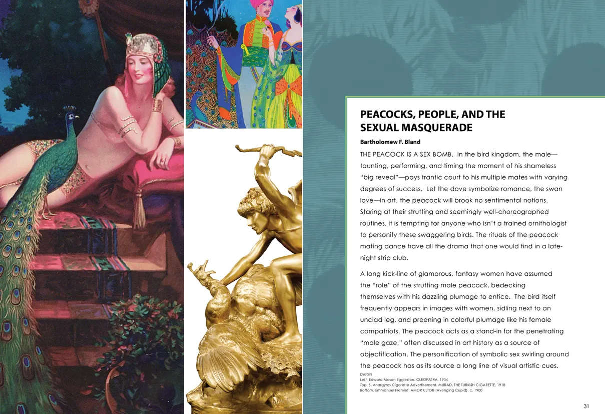
Strut: The Peacock and Beauty in Art was a major scholarly exhibition at the Hudson River Museum, tracing the peacock’s symbolism across more than 150 objects from the 19th century to the present. Because the catalogue was entirely essay-driven, we developed an expressive layout in which text and image interacted closely — typography flowing around sculpture contours, asymmetrical placements, and compositions that echoed the elegance and theatricality of the subject.
Each section opened with a designed spread featuring a full-bleed image collage and a decorative pattern page derived from historical textiles and peacock motifs found in the exhibition. These provided richly atmospheric gateways into each essay while keeping the scholarship accessible and inviting.
A comprehensive exhibition catalogue followed, including feature spreads, poem pages, and an intricate inside-cover grid that showcased the full breadth of peacock-related works. The design balanced scholarly rigor with a visually immersive language suited to the exhibition’s themes of beauty, vanity, and spectacle. Editor Linda Locke was closely involved in the design phase, offering insights and ideas that provided invaluable support and helped elevate the project.
Book design, layout, typography, image preparation, and production coordination by Alex Stevovich for Hudson River Museum.
- Strut: The Peacock and Beauty in Art exhibition catalog, pages 46-47
- Client: Hudson River Museum
- Strut: The Peacock and Beauty in Art exhibition catalog, pages 30-31
- Client: Hudson River Museum
Picasso Vollard: Prints from the Stock of the Artist’s Publisher
- Picasso / Vollard: Prints from the Stock of the Artist’s Publisher exhibition catalog, cover
- Client: Marc Rosen Fine Art
- Designer: Alex Stevovich / Colors in the Sky
- Client: Marc Rosen Fine Art
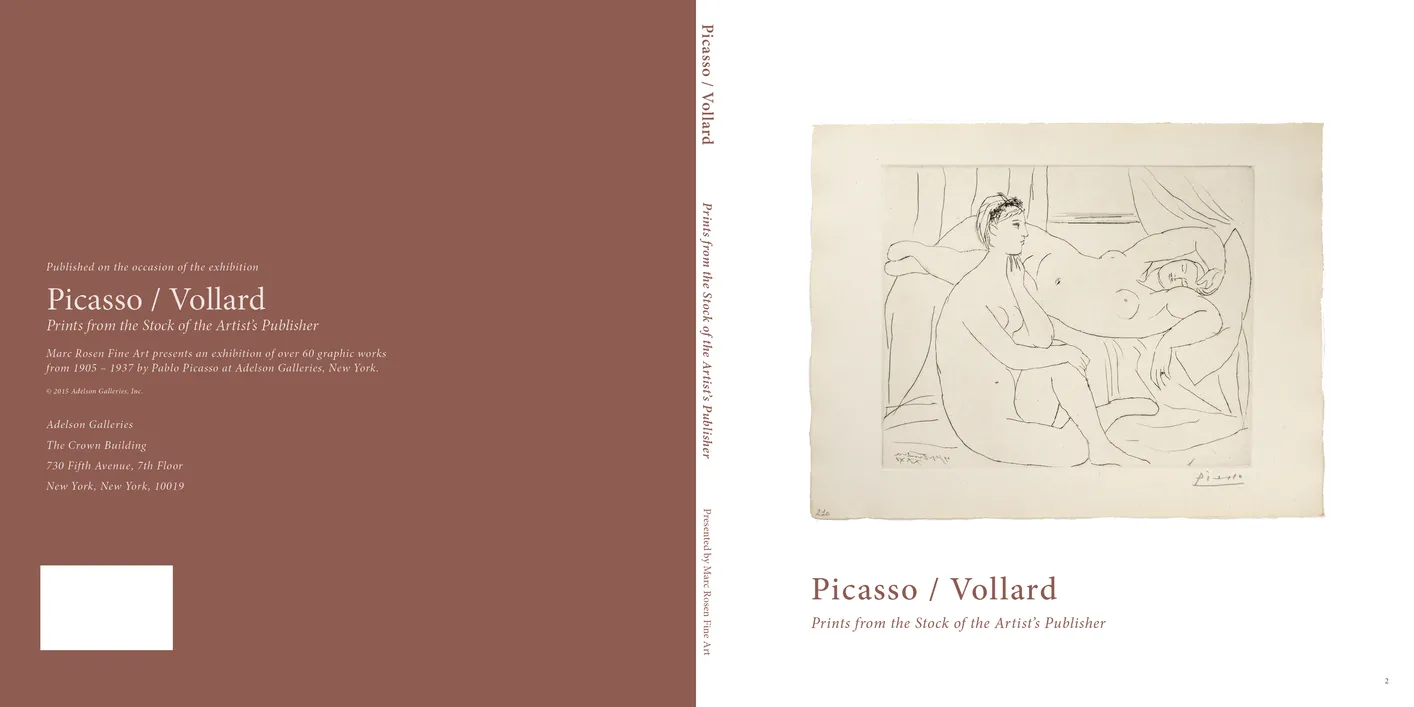
The Picasso / Vollard exhibition catalog highlights the profound relationship between Pablo Picasso and art dealer Ambroise Vollard, who gave Picasso his first solo exhibition in 1901. Vollard played a key role in Picasso's early printmaking, publishing the Suite des Saltimbanques in 1913. This catalog features key works from the suite, including Le Saltimbanque au Repos, and other rare prints such as L’Aigle and Le Poussin.
The Suite Vollard, spanning from 1930 to 1937, is a monumental series exploring themes of love, the artist’s relationship with his model, and mythological figures like the minotaur. Thirty-six iconic plates from this series are included, alongside details about the suite’s production and its later completion by Henri M. Petiet.
Produced in collaboration with Adelson Galleries, the catalog features a square format designed to provide ample space for the images, complemented by minimalist typography and detailed captions. The layout emphasizes clarity and elegance, with references to historical context and external sources. A digital companion is also available, offering a slightly reimagined design for modern viewers.
Book design, layout, typography, image preparation, and production coordination by Alex Stevovich for Marc Rosen Fine Art.

- Picasso / Vollard: Prints from the Stock of the Artist’s Publisher exhibition catalog, pages 12-13
- Client: Marc Rosen Fine Art

- Picasso / Vollard: Prints from the Stock of the Artist’s Publisher exhibition catalog, pages 44-45
- Client: Marc Rosen Fine Art
Staten Island SEEN
- Staten Island SEEN exhibition catalog, cover
- Client: Staten Island Museum
- Designer: Alex Stevovich / Colors in the Sky
- Client: Staten Island Museum
- Copy Editor: Linda Locke
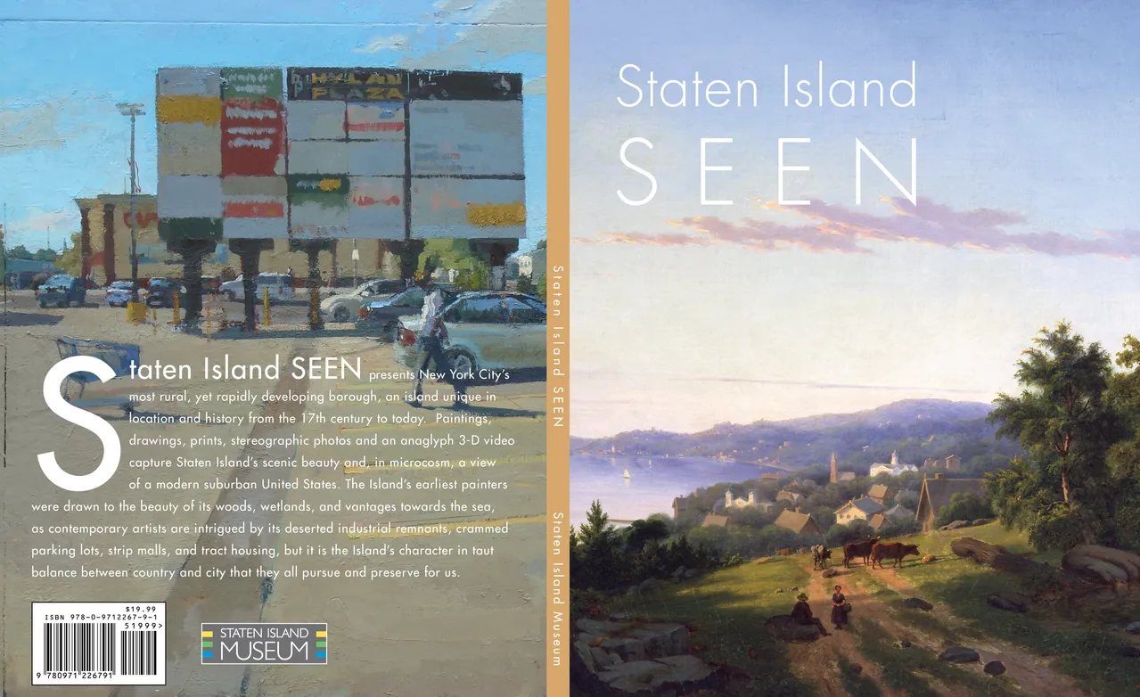
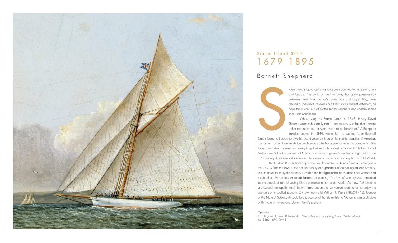
Staten Island SEEN was produced for the Staten Island Museum as a museum-style catalogue combining scholarly essays with a substantial plates section. Featuring landscapes and cityscapes spanning several centuries, the publication required a calm, open design that let the artwork’s rich color and atmosphere take precedence.
Given the abundance of striking horizontal works, we adopted wide, spacious layouts with minimal captioning and ample breathing room. Each essay opened with a full-width landscape and a bold drop cap, creating a strong visual entry into the historical narrative. The plates section followed a restrained fine-arts structure—clean spreads, consistent pacing, and typography suited to long-form reading.
Copy Editor Linda Locke was closely involved in the design phase, offering insights and ideas that provided invaluable support and helped elevate the project.
Book design, layout, typography, image preparation, and production coordination by Alex Stevovich for Staten Island Museum.
- Staten Island SEEN exhibition catalog, pages 16-17
- Client: Staten Island Museum
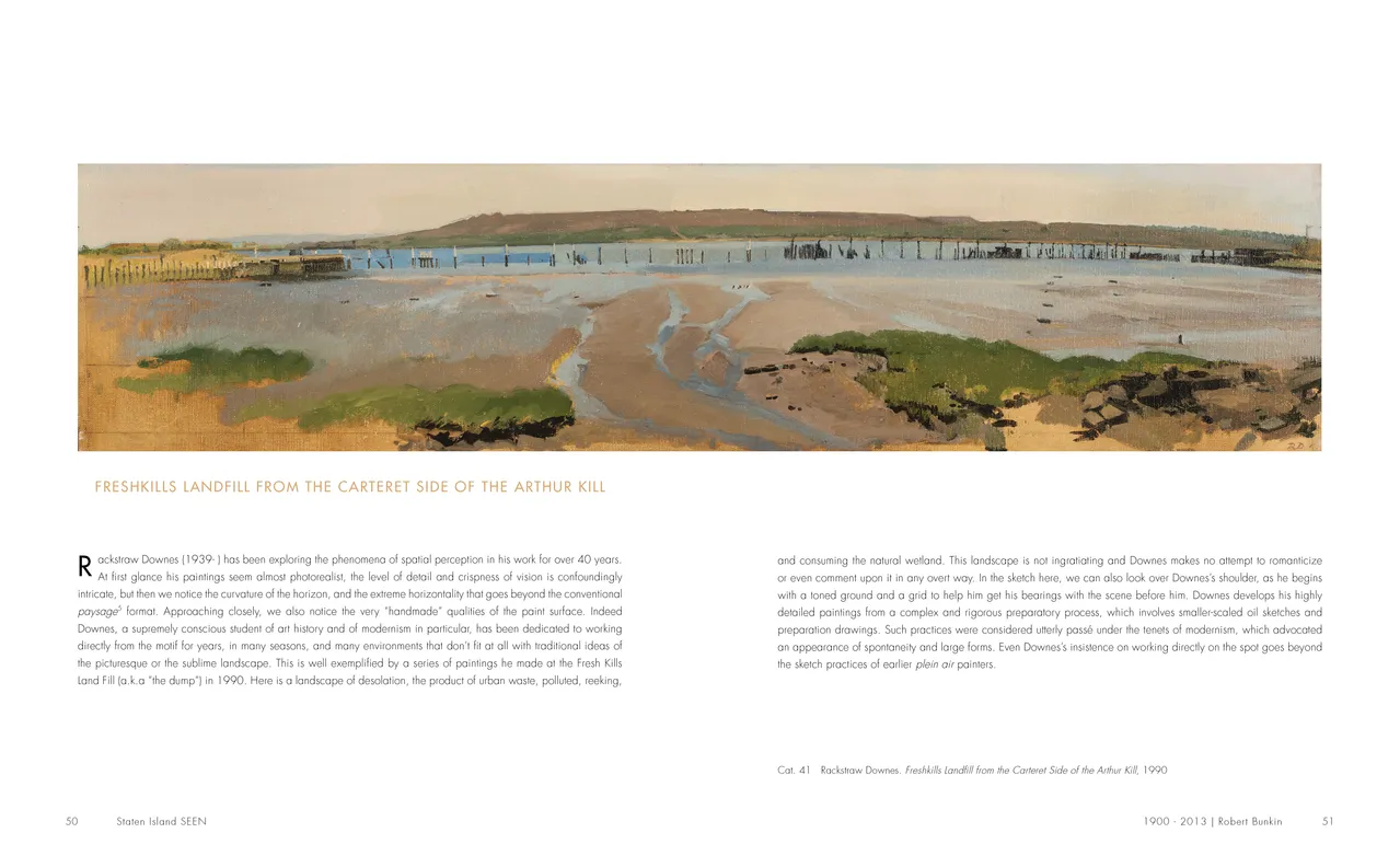
- Staten Island SEEN exhibition catalog, pages 50-51
- Client: Staten Island Museum
Andrew Stevovich: Beyond the Figure
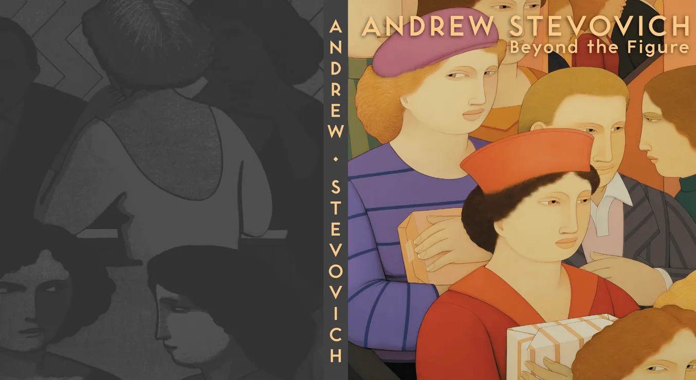
- Andrew Stevovich: Beyond the Figure book, cover
- Client: Adelson Galleries
- Designer: Alex Stevovich / Colors in the Sky
- Client: Adelson Galleries
- Publisher: Skira Editore Spa
- Publication Edit and Direction: Linda Locke
- Author: Michael Botwinick
Beyond the Figure is a major retrospective of the fifty-year career of Andrew Stevovich, published by Skira and produced in partnership with Adelson Galleries. The volume surveys 120 paintings and explores the artist’s recurring themes, formal language, and deep roots in European figurative traditions. For our studio, it was a particular honor to contribute to this project, given our long-standing admiration for Stevovich’s work and its place within modern figurative painting.
Structurally, the catalogue is organized into multiple thematic sections, each beginning with an essay followed by a dedicated plate sequence. Because the essays engage in rich comparisons with historical artworks, we developed highly designed layouts with distinctive compositions page-to-page, allowing these visual dialogues to unfold clearly and elegantly. Each section opens with a color theme anchored by a primary image and a decorative zigzag motif adapted from the iconic “Zig Zag Club” wall recurring in Stevovich’s paintings.
The plate sections follow a quieter fine-arts logic, pairing thoughtful spacing with clean typography to let the subtle narratives of Stevovich’s work speak for themselves.
Publication Editor/Director Linda Locke was closely involved in the design phase, offering insights and ideas that provided invaluable support and helped elevate the project.
Book design, layout, typography, image preparation, and production coordination by Alex Stevovich for Adelson Galleries.
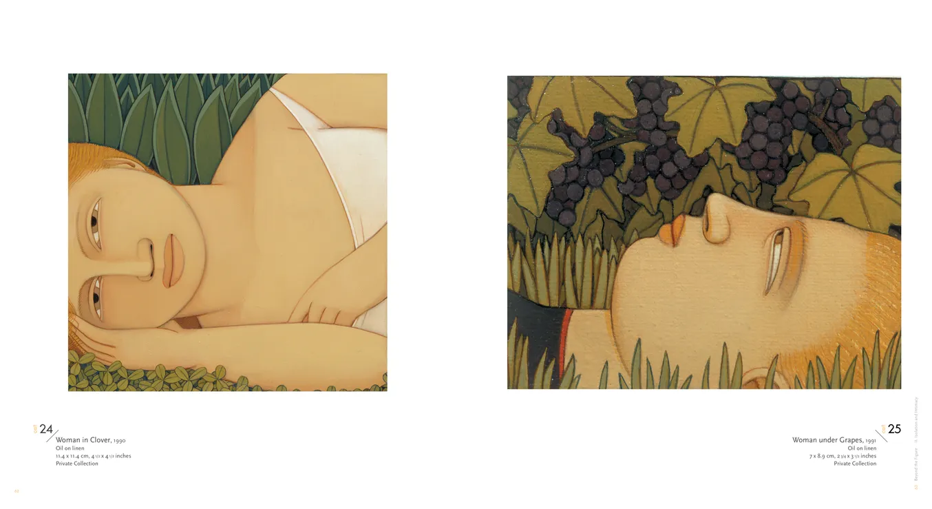
- Andrew Stevovich: Beyond the Figure book, pages 62-63
- Client: Adelson Galleries
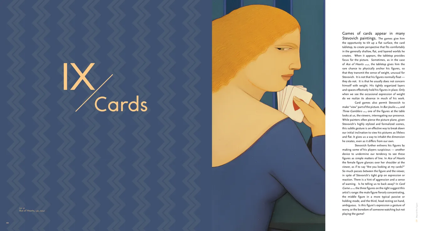
- Andrew Stevovich: Beyond the Figure book, pages 158-159
- Client: Adelson Galleries
Legacy of the Land
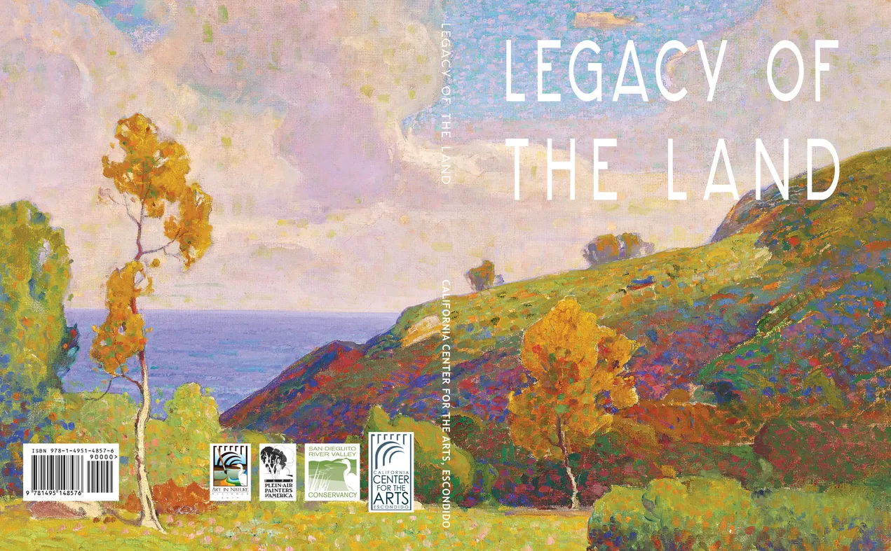
- Legacy of the Land exhibition catalog, cover
- Client: California Center for the Arts Escondido
- Designer: Alex Stevovich / Colors in the Sky
- Client: California Center for the Arts, Escondido
- Executive Editor: Robert Dudley
- Museum Coordinator: Stella Karl
- Editor: Leigh Fenly
Legacy of the Land was produced for the California Center for the Arts, Escondido as part of the Art in Nature Alliance, pairing pre-WWII plein-air landscapes with works by contemporary painters. The catalogue needed to reflect both the historic material and the living Californian landscape tradition.
Working closely with Executive Editor Robert W. Dudley, we shaped a design approach inspired by the paintings’ natural luminosity — vibrant greens, floral tones, and impressionist compositions. Essays were given brighter accent colors and a subtly decorative headline style suited to the show’s modern-impressionist character.
Each major section opened with a full-bleed detail spread to immerse readers in color and texture. The plate section followed a calm, structured layout, using soft dividers and clean captions to support images that needed contextual text. The overall design blended rustic warmth with refined clarity, creating a catalogue that honors both the historical legacy and contemporary vitality of Southern California landscape art.
Book design, layout, typography, image preparation, and production coordination by Alex Stevovich for California Center for the Arts, Escondido.
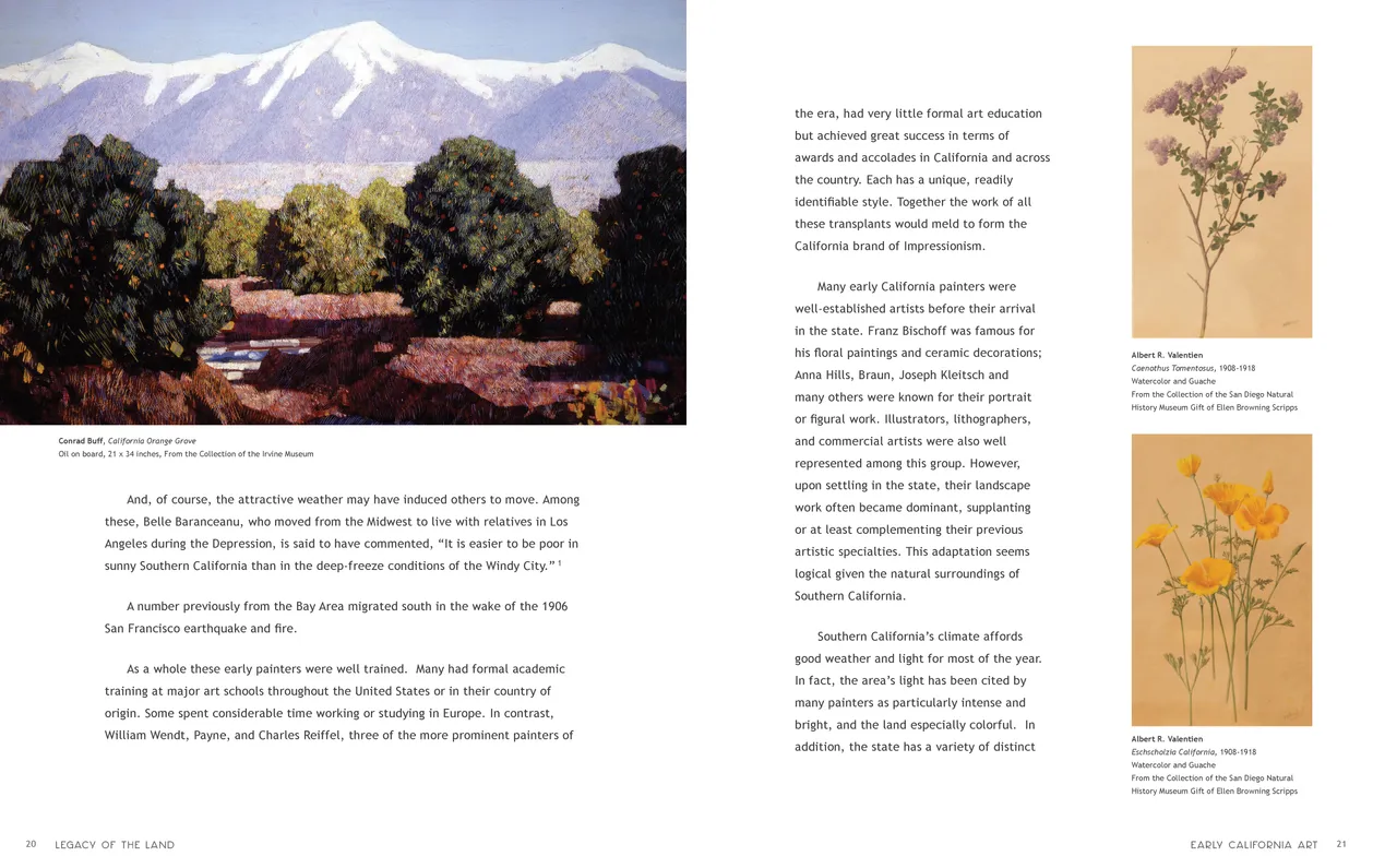
- Legacy of the Land exhibition catalog, pages 20-21
- Client: California Center for the Arts Escondido
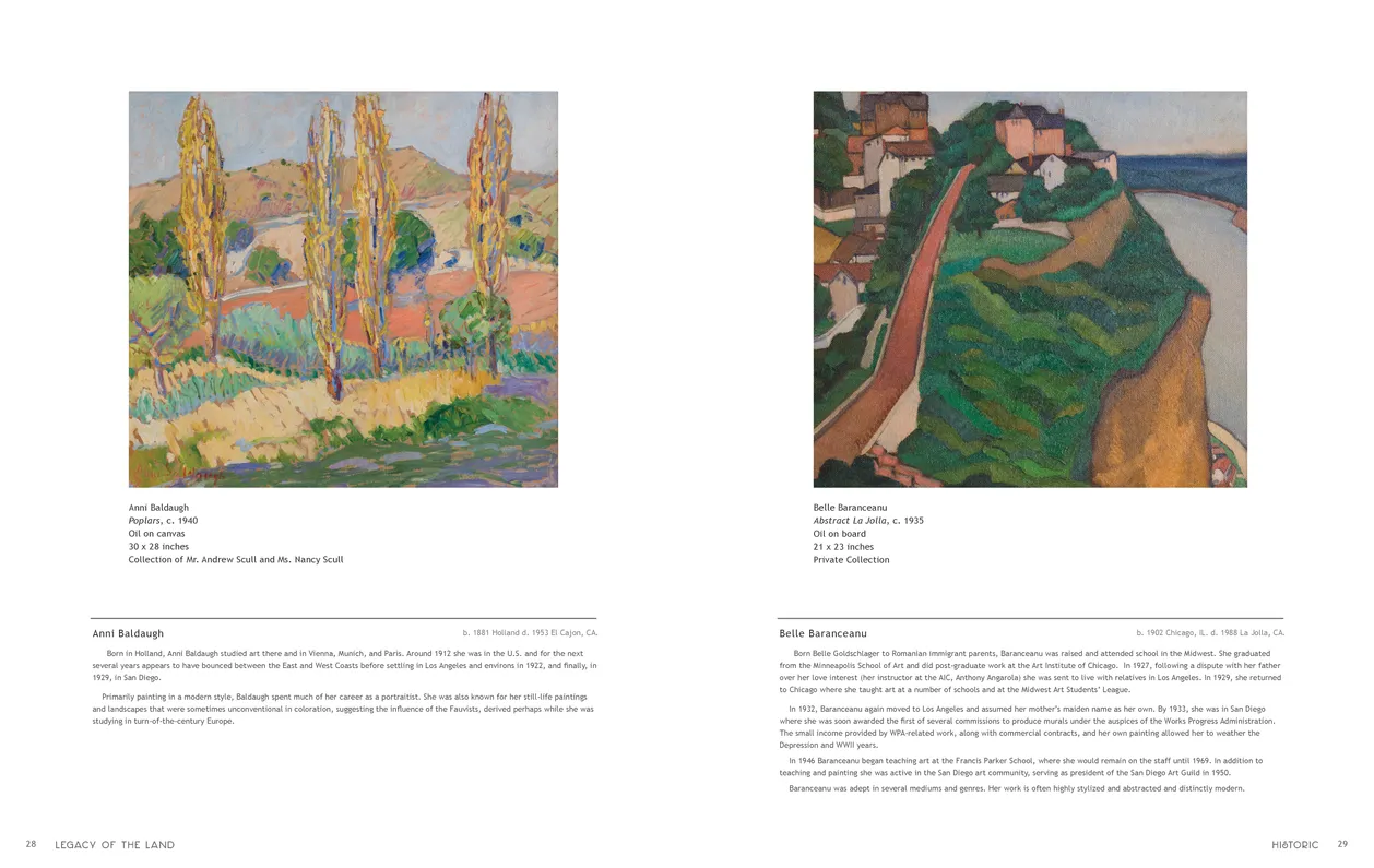
- Legacy of the Land exhibition catalog, pages 28-29
- Client: California Center for the Arts Escondido